Showing posts with label lettering. Show all posts
Tuesday, February 4, 2014
New Talent Alert: Kim Martin
Check out the portfolio of Kim Martin, specialising in food & beverage work for consumer products & packaging. Yum!
Monday, February 3, 2014
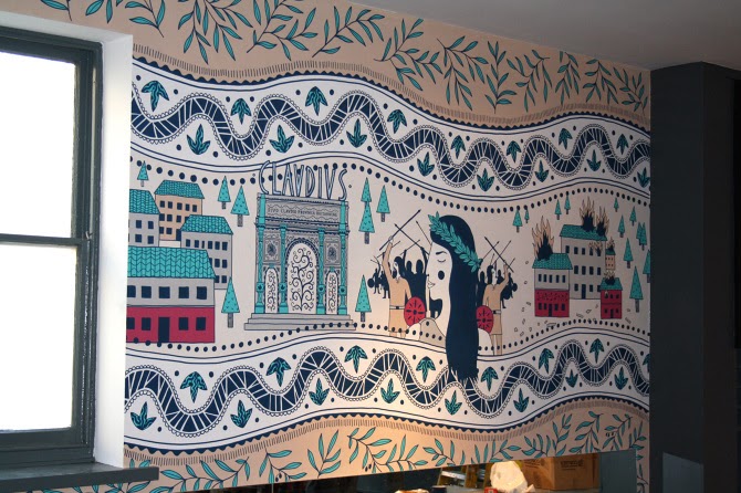
Zizzi Camulodunum!
Roman inspired mural
Zizzi Ristorante commission James Grover to create two murals for a refurbishment of their Colchester restaurant.
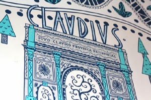
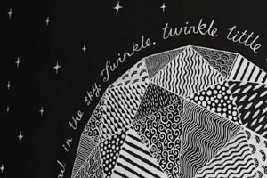
The first of the murals was inspired by Roman pottery and mosaics, James immersed himself in the history of Colchester (or Camulodunum as it was known in Roman times) to make this gorgeous decorative piece. The second appears on the stairway at the restaurant, a star in the night sky with “Twinkle, Twinkle, Little Star” written around the edge of a diamond - originally written as “The Star” by English poet and former Colchester resident, Jane Taylor. Both works of art were painted using acrylic paint pens and emulsion, and surely transform the interior from restaurant to gallery!
Labels:
decorative,
Food and Drink,
history,
James Grover,
lettering,
mosaic,
mural,
patterns,
pottery,
public art,
restaurant,
Romans,
stylised,
Zizzi Ristorante
Tuesday, January 14, 2014
A Positive Print
Shauna Lynn Panczyszyn works with Help Ink to create this feel good poster.
The organisation pairs with illustrators to create an image with the aim to raise money for various charities. Shauna's 'Positive Print', drawn in her fabulous chalk style went live yesterday and can be purchased here.
Labels:
chalkboard,
chalks,
charity,
design,
lettering,
message,
posters,
quotes,
Shauna Lynn Panczyszyn
Thursday, January 2, 2014
Bill Wyman Logo
Ruth Rowland works on the new Bill Wyman logo for his official web site.
Ruth says "The development stage included a range of hand rendered styles, from handwriting akin to his own signature to this wilder version of his name using a dry brush to create a distressed, edgy mark. Combined with the designer's bold background and retro photo, the lettering makes a powerful impact on the music legend's homepage."
Labels:
Bill Wyman,
bold,
custom lettering,
lettering,
lettering artist,
loose,
music,
Ruth Rowland,
web promo,
website
Thursday, December 19, 2013
Sarah Beetson's Design Classic
The piece which talks about Gregory and Paul's, an eatery under threat of closure, will appear in a new version of the magazine for ipad.
Sarah met the owner Paul at the end of 2011, before Hurricane Sandy changed the face of the Coney Island Beachfront. She says "We shared fried shrimp and coronas. I look forward to seeing Paul again in 2014. This time I hope to paint his portrait!"
![]() |
| Sarah Beetson and owner Paul in 2011 |
Sarah's article:
My design classic: Gregory and Paul’s
"Under threat of closure for decades, the Coney Island eatery is home to an inspiring array of handmade signage, says illustrator Sarah Beetson. Since 2002, I have made five pilgrimages to the place that inspires me most in the world: Coney Island, on the shores of Brooklyn. My most photographed spot there is Gregory & Paul’s eatery on the boardwalk, which has recently been renamed Paul’s Daughter. Founded by Paul Georgoulakos and his best friend upon their arrival from Greece in 1962, his daughter Tina now runs the show. The original building was constructed in 1939 with rounded corners and ornate wooden pillars. A classic in beachfront architecture, it was revamped in 2012. What’s really special about it though, is that it still incorporates all of Gregory and Paul’s original handpainted signage, with the cotton candy kids Chiefito and Chiefita, and Mr Shrimp still dominating the front panels. Brilliant as the new design looks to be, I’m still kind of sad that the ageing original has gone. Every single item available in the shack is written haphazardly in veritable Technicolor all over the walls; a naively brilliant exploitation of free advertising space. The signwriter has even lent his hand to a ‘Please Wash your Hands’ sign in the employee bathroom. There is a magically authentic retrograde feel about the diner that is evoked by the signs. The place is a permanent pastel- come-spaceage 1960s time capsule".
See more on Sarah Beetson's Coney Island Dream Campaign.
Labels:
article,
campaign,
computer arts,
Coney Island,
design,
fashion,
feature,
informative,
lettering,
pop,
Sarah Beetson,
stylised,
USA
Wednesday, December 18, 2013
Reading Unbound
Scholastic commission Shauna Lynn Panczyszyn to create a book cover illustration for 'Reading Unbound'.
The brief was to make a chalk cover using a list of buzzwords, Shauna says "I played (with) the words and worked to make them feel fun and lively, as well as pulling in a few fun elements like the Mockingjay pin for the Hunger Games (one of my favorite books!)".
The book argues 'Why Kids Need to Read What They Want--And Why We Should Let Them" and is out in January.
Friday, December 6, 2013
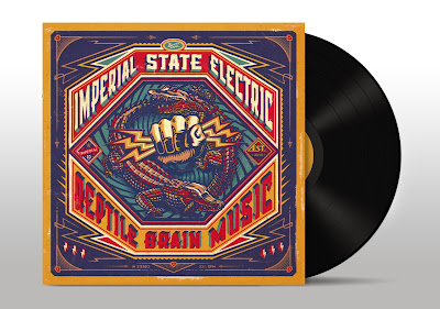
Reptile Brain Music
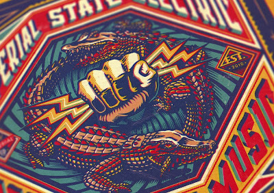
BoomArtwork produces an album cover for Swedish rock band Imperial State Electric.
Nicke Andersson; former front man of The Hellacopters approached BoomArtwork to create the art for the vinyl album of his new band. He asked for something bold and vintage to illustrate the record title 'Reptile Brain Music', so BoomArtwork set to work using his fabulous design and illustrative skills and made this punchy retro visual, he says "... First I drew the hand of Zeus with my brush and ink, and then the crocodiles eating each other's tail. In Photoshop I placed everything together and then started with the typography. Instead of using an existing typeface I thought it would make the album more special to create custom lettering. After finishing I added some filters to make it look like it was released in the 70's. It was so much fun to illustrate an LP album cover, as it is such a cool, tactile canvas to work on."
Subscribe to:
Posts (Atom)