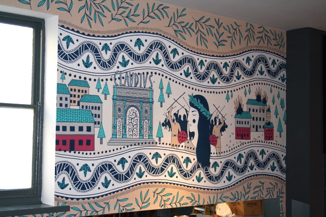
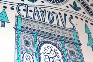
Wednesday, March 21, 2012
Hanover Square Development
Claire Rollet has been working on a promotional brochure for a prestigious Mayfair address. The commission from Winkreative Design Agency involved Claire visualising interiors and exteriors for this upmarket piece. Claire says " The prestigious Mayfair address will be home to a new landmark office, residential and retail building opening 2012. Working with Petek Sketcher at Winkreative has been a fantastic experience of professionalism and upbeat work."
Labels:
architecture,
brochure,
buildings,
business,
Claire Rollet,
corporate,
design,
drawing,
Figure and People,
flat colour,
interiors,
line,
London,
travel
Tuesday, March 20, 2012
Habitat Loss
This collection of watercolour paintings by Daniel Mackie studies animals in their natural habitats. Finely executed, the paintings have their natural environment illustrated within them, but Daniel's interest goes beyond the surface. He says "Some (animals) are listed by the IUCN as critically endangered, like the tiger and the mountain Gorilla, others like the bear have adapted to the presence of humans well. But with all of them the encroachment of man into these animals' natural environment is detrimental. Logging, food production, poaching and settlements all have impacted, and in the case of the tiger and the mountain gorilla their ability to prevail in the wild teeters on a knife edge."
Labels:
Animal and Nature,
Daniel Mackie,
detail,
realistic,
watercolour,
wildlife
Monday, March 19, 2012
Vogue Beauty Products
Kavel Rafferty's drawings appear in the April issue of Vogue, out now. Advertising creams which are good to blend, the images are illustrated in Kavel's naturally confident style. She says "When I was a teenager I used to cut up my mum’s Vogues to make my collages, she’d open her latest copy unaware that I’d hacked into some model’s face or torn out a whole page, I also used her ‘good’ scissors which were sacrosanct, my poor mum."
Friday, March 16, 2012
Shatila Art Project
Miss Led has drawn a beautiful portrait for the Shatila Art Project. The piece is to be donated to the project, which will then be auctioned on 26th March, with all proceeds going to the cause which raises money for young people. Miss led says "The project will involve teaching young people in a refugee camp in Lebanon basic aerosol painting skills to improve their environment, build friendships, confidence and hopefully the chance to visit England for an exhibition of resulting artworks." Miss Led is one of 6 artists involved, the others being Jon Burgerman, Paul Davidson, D*Face, Dan Hillier and Kid Acne.
Thursday, March 15, 2012
Flood
Award winning illustrator Robert Carter has painted this moody illustration for Alberta Venture Magazine. 'Flood' tackles the issue of southern Alberta farmers who have found themselves bailing floodwater, cleaning up their properties and paying for uninsured damages for the last two years. 'Now, both land owners and insurance industry executives think it might be time for a change.'
Labels:
Animal and Nature,
atmospheric,
conceptual,
digital,
farming,
loose,
painterly,
realistic,
Robert Carter,
weather
Wednesday, March 14, 2012
Read For Good
Keith Robinson's work for the charity 'Read For Good' continues with this latest set of illustrations. The images which are for a variety of uses such as bookmarks, certificates, sponsorship cards and posters, are to communicate the pleasure kids can get from reading. Last year, Keith designed the mascot and logo for the charity; Jamie and the orange balloon can be seen 'unifying' this set of images.
"'Read for Good' improves children's lives by encouraging and enabling children in primary and secondary schools to enjoy the powerful positive effects of reading for pleasure. In doing so these children also fundraise fantastic sums of money - to help seriously ill children across the UK."
Patronaat Posters
BoomArtwork has done a great job with these 2 posters for the Dutch venue Patronaat. The illustrations are to promote two 'post-punk-psychedelic-space-rock mini festivals'. BoomArtwork says " I choose to go for a psychedelic school-board chalk treatment to make these posters really stand out when put up on walls around the city. They are going to be printed with a matt varnish to make them really look like a blackboard."
Labels:
advertising,
BoomArtwork,
chalkboard,
chalks,
digital,
Eric Van Den Boom,
lettering,
lettering artist,
music,
posters,
psychedelic
Country Life Icons Of Style
These two watercolour spreads by Christian David Moore are for the current Country Life Magazine. Christian is working for the title each month producing 'icons of style' images. He is an expert with watercolour, here producing a couple of of very fresh, confident paintings.
Labels:
cars,
Christian David Moore,
editorial,
fashion,
Fashion Illustration,
glamour,
jewellery,
loose,
painterly,
realistic,
travel,
watercolour
Tuesday, March 13, 2012
Dover Street Market Installation
Rohan Eason is the man behind this installation at Dover Street Market, for Comme Des Garcon; the second launch of the book 'Anna and the Juniper Dog'. Four of Rohan's originals from the book hang against the space which is covered in drawn threads and needles. Rohan says "(It's) quite a good coo for the book, and the installation should be making its way to the new Japanese store this year." Running til 16th March, there's still time to see it if you're local; Dover Street market 17-18 Dover Street, London W1S 4LT.
Wife 22
This lovely book jacket by Madamesange is a for a debut novel by Melanie Gideon. The book, set to be published in June by HarperCollins is "about a woman amidst a midlife crisis who agrees to anonymously participate in a survey about marital happiness", Madamesange's delicate lines frame the organic lettering resulting in a sophisticated cover. More info on the book.
Labels:
bookjacket,
books,
decorative,
drawing,
lettering,
Madamesange,
publishing
Monday, March 12, 2012
Dirty North
These punchy drawings for Manchester's 'Dirty North' are by pen and ink master Ben Tallon. Working with the band, Ben has produced gritty artworks for the single and album inlay. Ben says "'The Blues' is the new single from Dirty North, a three piece from Wythenshawe, Manchester fusing reggae with rap and guitar music...... I met the boys in Wythenshawe, Europe's biggest council estate. We toured the local hangouts where the boys grew up, providing much fuel for the lyrics and musical identity. I photographed everything from graffiti on the underpass to melted wheelie bins, attracting attention from a few bystanders. The results delighted the band and The Blues is out now on Corporate Records." Dirty North are also rumoured to be supporting The Stone Roses at Heaton Park.
Labels:
album covers,
architecture,
Ben Tallon,
buildings,
digital,
drawing,
Figure and People,
line,
loose,
music,
pen and ink,
portraits,
urban,
youth,
youth culture
When In Rome
Published by Anova Books, "When in Rome" is a comical gift book illustrated by Willie Ryan. With over 65 images, the book is a "cultural etiquette guide to help travellers from embarrassing themselves, and their country when holidaying abroad". Willie's stickmen illustrate the scenarios perfectly in this alternative guide, due to be released next month. When In Rome on Amazon.
Labels:
adult humour,
books,
Cartoon or Humor,
digital,
flat colour,
gift books,
graphic,
logo,
narrative,
Willie Ryan
Grumpity Grump's Lumpity Stump
Pete Pachoumis's latest venture into children's books has created a storm. "Grumpity Grump's Lumpity Stump" is a charming story about friendship, written and illustrated by Pete. He says " I created Grumpity Grump's Lumpity Stump so I could have something created solely by me to share with my daughter when she gets a little older. I believe it’s important to instil values in our children such as friendship, imagination, outdoor play, sharing, and humor, and these things are embodied in the story. I enjoyed every step of the creation of Grumpity Grump's Lumpity Stump and was proud of its digital download debut at #5 on Amazon.com’s “Hot New Releases” for children's activity books. Due to overwhelming demand, I am in the process of creating a physical copy of the book to be sold online and in retail stores." Check it out here.
Sunday, March 11, 2012
Skins Logo
Ben Tallon's vivid Skins logo and graphics have been airing for the new season on E4. The fresh, 'just painted' logo is also being used on the Skins Twitter account and Facebook page.
Thursday, March 8, 2012
Premiere Magazine Plan B
Paul Holland is the illustrator behind a regular column for France's Première Magazine. The article asks stars from the big screen 'What if you were not an actor/actress, plan B?' Here Megan Fox shows her love for the aquatics & marine biology, and James McAvoy who believes that he would undoubtedly be selling bread & pastries!
Wednesday, March 7, 2012
Kat Cameron's Scrapbook
Australian based illustrator Kat Cameron on her love of the '60's lifestyle & fashions, bold colour & pattern. Kat Cameron's Scrapbook.
Monday, March 5, 2012
Pick Me Up
Making the final 20 artists selected for Somerset House Pick Me Up 2012 is an immensely excited Sarah Beetson. Pick Me Up is the UK’s contemporary graphic art fair and festival celebrating all forms of graphic arts. Not only does the fair showcase work from the best illustrators, graphic novelists, cartoonists and designers from the UK, it also offers the opportunity to meet and watch them work. Sarah Beetson will be exhibiting originals, prints, cushions and specially created clothing as well as doing live portraits at the fair for £75 each - it’s a must see if you are in London this month. The exhibition takes place at Somerset House, Embankment Galleries, Strand, London WC2R 1LA and opens on 22nd March, running until 1st April. For more info look here.
Labels:
clothing,
exhibition,
fashion,
Fashion Illustration,
Figure and People,
flat colour,
furnishings,
interiors,
lettering,
line,
loose,
mixed media,
pop,
portraits,
punk,
Sarah Beetson,
stylised
Friday, March 2, 2012
Stephen Graham
This striking portrait of the actor Stephen Graham is by Matthew Hollings for the current edition of Nuts Magazine. The brief was to illustrate him using union jack colours, with red splatters to hint at the violent characters he often portrays.
Labels:
celebrities,
drawing,
editorial,
Figure and People,
loose,
Matthew Hollings,
portraits,
realistic
Thursday, March 1, 2012
Rowland's Diagrams
Ruth Rowland's versatility as letter artist and illustrator continues with these diagrams using her individual skills. Ruth says "Encouraged by the popularity of my maps, I've started to produce a range of diagrams....... Loose and dynamic - these new additions to my portfolio are based around the subject of astronomy and aim to convey accurate information while capturing the excitement of the subject."
Labels:
astronomy,
calligraphy,
diagrams,
drawing,
editorial,
informative,
lettering,
lettering artist,
line,
loose,
physics,
posters,
Ruth Rowland,
scientific,
typography
Wednesday, February 29, 2012
Innovation Centre Mural
Andy Council has done a wonderful job with this recent commission for University of Bath’s Innovation Centre. The large mural is painted on the wall of the Centre's new DigiCity space for creators, coders, innovators, cool digerati (people who have a very sound understanding of computer technology), those that live and work in Bath and those who are just passing through. Andy says "The spraypaint and acrylic mural is of a huge dragon type creature made up of Bath city landmarks. Being a flying dragon represents the new, change and innovation that the centre is all about. It is a nod to the old icons in the city but is modern in it's execution and style. It is relevant being the Year of the Dragon and the rise of the East. The centre aims to have connections to the east and all over the world." For more information on this commission look at Bath Digital and Bath University.
Andy's work cleverly fuses drawing with architecture, structure and character, for a strong individual look.
Labels:
Andy Council,
Animal and Nature,
architecture,
buildings,
detail,
drawing,
flat colour,
graffiti,
houses,
mural,
public art,
spray paint,
street art,
stylised,
travel,
urban
Monday, February 27, 2012
First Time Nerves
First Time Nerves is an exhibition of images by Derek Bacon. Running from March 16th-30th 2012, the show is an exciting celebration of his illustrative and personal work.
"Entirely self-taught, Derek is an accomplished illustrator best-known for his many worldwide covers for The Economist, as well as for UK publications, The Times, The Guardian, Maxim, and Wired, and too for other publications around the world. The exhibition is a great chance to see his highly-detailed work in close-up, and to see his skills across a range of disciplines: from more traditional pen-and-ink work, to digital paintings made entirely in Photoshop. Also on show will be a series of acrylic-based portraits painted last summer. Born in London, Derek has lived in Madrid and Jakarta, and for the longest, in Poole. He likes Carry-On films, fish and chips, Giles cartoons, The Beatles, and is a big collector of found-sound. You have been warned."
The exhibition takes place at The Artworks, Enefco House, Ball Lane, Poole Quay, Poole, England.
Friday, February 24, 2012
Sam's Words
These two pieces are from Sam Bevington's ongoing personal project experimenting with hand drawn type.The text is cleverly designed by Sam, with no fonts involved. Sam says "The words themselves are from a couple of northern soul classics: 'Come on Train' by Don Thomas and 'Messin with the Kid' by Junior Wells.
Labels:
design,
lettering,
lettering artist,
music,
retro,
Sam Bevington,
typography
Wednesday, February 22, 2012
Theatrical Supercar
Emma Rios has been working with Pencil Agency on this ad for Mercedes. Featuring the actress Emilia Fox, the ad uses Emma's skills as a set designer to create the backdrops for the story, which were then painted by a scenic artist. The ad is a good humoured 'to be continued' tale, framed by Emma's expressive lines.
Labels:
3d,
advertising,
Animal and Nature,
architecture,
Emma Rios,
line,
loose,
paper engineering,
paper sculpture,
pen and ink,
TV
Jamel Akib's Scrapbook
Illustrator Jamel Akib on his regard for the fine artist sensibilities of 1980's illustrators & finding inspiration in his Mother's suitcase. Jamel's Scrapbook.
Labels:
architecture,
business,
chalks,
cities,
conceptual,
economy,
Figure and People,
Jamel Akib,
loose,
painterly,
pastels,
portraits,
realistic,
scrapbook,
travel
Subscribe to:
Posts (Atom)


