Showing posts with label design. Show all posts

Tuesday, February 4, 2014

New Talent Alert: Kim Martin

http://www.illustrationweb.com/KimMartin

Check out the portfolio of Kim Martin, specialising in food & beverage work for consumer products & packaging. Yum!

Wednesday, January 29, 2014

Kena Ravel's Scrapbook

http://www.illustrationweb.com/PortfolioScrapbook.aspx?artist_id=3559
UK born, Massachusetts based illustrator Kena Ravel's artwork & characters are inspired by everyday life & stories. ..Kena Ravel's Scrapbook.

Tuesday, January 21, 2014

New Talent Alert: Kaitlin O'Connor

http://www.illustrationweb.com/KaitlinOConnor

Brooklyn-based illustrator and graphic designer Kaitlin O'Connor's striking artworks have graced the pages of magazines on both sides of the pond, including Nylon, Lamono and Company. Kaitlin's portfolio...

Wednesday, January 15, 2014

Anne Wilson in Mac User

Anne's feature in Mac User


a selection of Anne's art used in the article
January's edition of Mac User Magazine features an article on the wonderful Anne Wilson. Experiencing the industry in times before our digital world, Anne talks of the changes, her illustration education and inspirations with some sound advice; " just do what you do".

The article:
I have been practicing as an illustrator for the past 15 years or so...the time seems to have flown past so fast at an unbelievable rate. During this time the technology I've experienced has evolved tremendously. One of my very first commissions for example was completed through to the finals stage using a fax machine! Email now is second nature, and the format now in which discussions on projects tend to take place in the main, to the point where now I cannot remember the first time I began using email! It has always been a highly competitive industry and unless, for the most part, illustrators keep an eye on the technology available to them and embrace it in their working practice, those around will most likely have the upper hand.
I love the global feel of the industry, now more apparent than ever. Often I get work via the USA and recently I have completed a few jobs for various clients in Korea. The days of hiking around London with my portfolio focusing in the main on UK based clients, has passed and evolved into an exciting mix of cultures, opportunities and inspiration on a world wide basis.
On the one hand there seems to be a constant barrage of fightingly good illustrators graduating and entering the industry today, bright eyed, fast paced and full of imagination, which is both wonderful and overwhelming for me. But on the other hand it provides a pool of fantastic inspiration which serves to keep me well on my toes year after year. As this career tends to be a rather solitary one, the reality of the competition for commissions is important, a good reason I feel to take the time and energy to enter industry led competitions when ever possible. They serve as a good tool to sharpen your creative processes and a bench mark for where you are at within the illustration world.
New creatives are certainly one source of inspiration. More and more creative collectives are appearing such as the illustrator led groups of Ohh Deer and No Brow, but global culture in the main endlessly fascinates me, from intricate details, patterns, textures, colours and beliefs people possess and live their lives by.
What would I be lost without? Well the traditional side of me would undoubtedly opt for my Swan Morton scalpel, with blade 10a, and the current side of me would say my Wacom drawing tablet and pen (teamed up with my Mac and Photoshop.) I think it is important to embrace both sides, to pick up a pencil, or my dip pen and ink and commit to a drawing, or make marks with mono prints and any other mixed media I might care to throw at a surface in the moment. Neither are seen as a separate entity and when the two working methods are brought together, exciting things evolve from their meeting. I enjoy the physical process of colour mixing and mark making according to what might be suitable for the project I am working on. These results then get scanned and imported into Photoshop to create a final image. Increasingly it is my Wacom pen and eraser tool which becomes my scalpel.
I certainly don't even pretend to be remotely wise, but if I had a little wisdom to share, I would say keep it all positive, be 'can do' in your communications with clients and get plenty of fresh air!
I have always felt compelled to draw and create something on paper or whatever comes to hand. I loved picture books as a child and as my reading progressed I would still look for the pictures! I think since school I had in my mind that creating pictures to tell a story or describe something was what I wanted to aim for, just to see if maybe I could give it a go, and maybe I might be able to keep doing it, and just maybe, if that happened I could make it my job! The funny thing is, that I still don't feel I have a 'job', so in an obscure sort of way that makes me a very lucky person!
So I progressed as follows; school, (start drawing) A levels, (keep drawing) Art Foundation course, (more drawing) Degree - BA Honours at Bath, (definitely some drawing here) and then I went to do an MA in Communication Design at St Martins College of Art in London a few years ago, where I was lucky enough to get a Distinction, (masses of drawing stuff went on here!) There was no other obvious career paths for me, in my mind it was simple, I love drawing and creating images, so all I have to do it keep creating and I felt that one day I would become a professional creative of some sort - illustration fitted the bill nicely.
Some of my favourite projects have been children's picture books, I have completed several for Barefoot Books, but other recent clients include The London Transport Museum, The Independent On Sunday, The BBC, Mojo Magazine, Francis Lincon, Feast Creative, Beam, Crocodile Creek and Save the Children.
So that's me in brief! I would add though that one thing I have learnt through time, frustration, joy and the general madness my creative world involves, is that you can over think things to the point where you just can't see...my answer, is to take a deep breath...and just do what you do.

Tuesday, January 14, 2014

A Positive Print

http://www.illustrationweb.com/ShaunaLynnPanczyszyn

Shauna Lynn Panczyszyn works with Help Ink to create this feel good poster.
The organisation pairs with illustrators to create an image with the aim to raise money for various charities. Shauna's 'Positive Print', drawn in her fabulous chalk style went live yesterday and can be purchased here.

Friday, January 10, 2014

Modern Twist Designs

http://www.illustrationweb.com/HelenLang
children's bib and table mat designs

http://www.illustrationweb.com/HelenLang
sea pattern table mat

Helen Lang works with San Francisco based Modern Twist to create designs for their baby and kids range.
Commissioned to supply four animal designs to be used on children's table mats and bibs, and a sea pattern for another range, Helen used her signature lines to produce these fun and friendly products. She says "This company has been great to work with. The products are great to touch and use."

Wednesday, January 8, 2014

Gregor on the Sherlock Set

http://www.illustrationweb.com/MaxGregor
Max at work on the Sherlock set
http://www.illustrationweb.com/MaxGregor
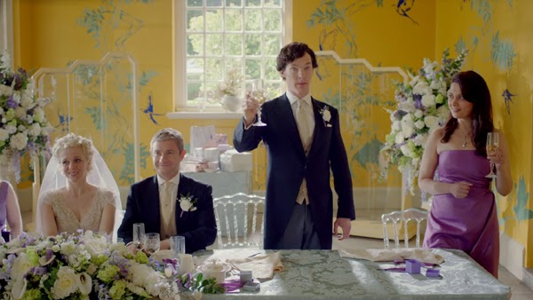
views of the final mural in the wedding scene
http://www.illustrationweb.com/MaxGregor
  
wedding invite motif

Max Gregor designs and paints a mural for the backdrop of Watson's wedding in a recent episode of BBC's Sherlock. Commissioned by the Production Designer, Max also created a black and white motif for the wedding invite seen in popular crime drama.

Monday, January 6, 2014

My Favourite Bird

http://www.illustrationweb.com/HannahDavies

Hannah Davies collaborates with NV London Calcutta to produce this beautiful silk scarf design.
'My Favourite Bird' comes in black and gold as well as some other punchy colours and is perfect for this time of year. Made by NV; a 'future friendly, award-winning, ethical accessories company', the scarves are screen printed by hand, using traditional methods.

Thursday, December 19, 2013

Sarah Beetson's Design Classic

http://www.illustrationweb.com/SarahBeetson

Sarah Beetson's article for Computer Arts on her Coney Island design classic is to be re-published.
The piece which talks about Gregory and Paul's, an eatery under threat of closure, will appear in a new version of the magazine for ipad.
Sarah met the owner Paul at the end of 2011, before Hurricane Sandy changed the face of the Coney Island Beachfront. She says "We shared fried shrimp and coronas. I look forward to seeing Paul again in 2014. This time I hope to paint his portrait!"
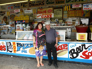
Sarah Beetson and owner Paul in 2011

Sarah's article:

My design classic: Gregory and Paul’s

"Under threat of closure for decades, the Coney Island eatery is home to an inspiring array of handmade signage, says illustrator Sarah Beetson. Since 2002, I have made five pilgrimages to the place that inspires me most in the world: Coney Island, on the shores of Brooklyn. My most photographed spot there is Gregory & Paul’s eatery on the boardwalk, which has recently been renamed Paul’s Daughter. Founded by Paul Georgoulakos and his best friend upon their arrival from Greece in 1962, his daughter Tina now runs the show. The original building was constructed in 1939 with rounded corners and ornate wooden pillars. A classic in beachfront architecture, it was revamped in 2012. What’s really special about it though, is that it still incorporates all of Gregory and Paul’s original handpainted signage, with the cotton candy kids Chiefito and Chiefita, and Mr Shrimp still dominating the front panels. Brilliant as the new design looks to be, I’m still kind of sad that the ageing original has gone. Every single item available in the shack is written haphazardly in veritable Technicolor all over the walls; a naively brilliant exploitation of free advertising space. The signwriter has even lent his hand to a ‘Please Wash your Hands’ sign in the employee bathroom. There is a magically authentic retrograde feel about the diner that is evoked by the signs. The place is a permanent pastel- come-spaceage 1960s time capsule".

See more on Sarah Beetson's Coney Island Dream Campaign.

Friday, December 6, 2013

Reptile Brain Music


 http://www.illustrationweb.com/BoomArtwork

http://www.illustrationweb.com/BoomArtwork


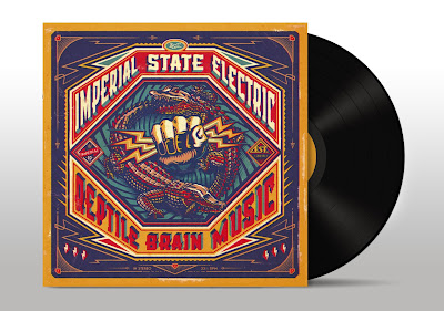
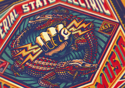
BoomArtwork produces an album cover for Swedish rock band Imperial State Electric.
Nicke Andersson; former front man of The Hellacopters approached BoomArtwork to create the art for the vinyl album of his new band. He asked for something bold and vintage to illustrate the record title 'Reptile Brain Music', so BoomArtwork set to work using his fabulous design and illustrative skills and made this punchy retro visual, he says "... First I drew the hand of Zeus with my brush and ink, and then the crocodiles eating each other's tail. In Photoshop I placed everything together and then started with the typography. Instead of using an existing typeface I thought it would make the album more special to create custom lettering. After finishing I added some filters to make it look like it was released in the 70's. It was so much fun to illustrate an LP album cover, as it is such a cool, tactile canvas to work on."