Showing posts with label paper engineering. Show all posts

Friday, January 24, 2014

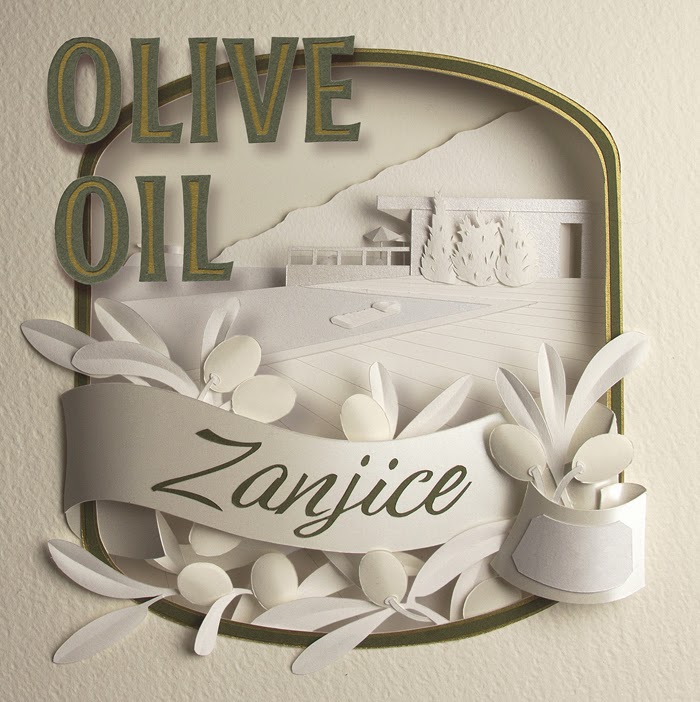
Zanjice Olive Oil


http://www.illustrationweb.com/GailArmstrong

This fabulous label creation from Gail Armstrong is a personal project done as a "thank you" for some friends. 
After a holiday last summer in Zanjice - a fairly cut-off part of Montenegro, Gail discovered that all the olives from the area were gathered from everyone's property at the end of the season and sent to the community press to be made into olive oil. She says " However, the hand-written labelling left much to be desired, so as a "thank you" I created these olive oil labels. The paper sculpture scene is the view across the swimming pool of one of the landmark villas in the area and the ribbon flourish has a blank area where the date of pressing can be written."

Friday, November 22, 2013

Mace Bauer Mysteries


 http://www.illustrationweb.com/GailArmstrong


http://www.illustrationweb.com/GailArmstrong
small images for spine and back
Gail Armstrong creates two book cover illustrations for Llewellyn Worldwide.
'Mama Gets Trashed' and 'Mama Does Time' by Deborah Sharp are part of the Mace Bauer Mystery series; stories based in Florida involving biologist Mace and his mother who stumble upon murder victims and then feel compelled to investigate. The brief was to make artwork that reflected the humour in the books whilst feeling 'light, fun and colourful' to evoke the Florida warmth. Gail says "... I worked with a palette that seemed to reflect Florida colours and created the front cover image that illustrates a key event in each of the books. The type and background repeat pattern work to tie the books together visually. There is also a smaller, related image for use on the spine and back of each of the books."

Friday, September 27, 2013

Price per KWh


Commissioned by Haas Taguiri of Which? Gail Armstrong uses her paper skills for their current campaign on energy prices.
The image, which is used across all the relevant pages on their website and in the Which? magazine tackles the current confusion over the price of Gas and Electricity. Gail says "The gas hob doubles as a target device, whilst the surrounding flames incorporate lightbulbs, to cover both types of energy. I used concentric circles on the background to create added depth and give the illusion of heat energy radiating from the target hob. The colour palette was chosen to compliment the existing page design."

Friday, September 20, 2013

Wonderhill Market


This flyer design for Wonderhill Market's September events has been created by the brilliant Vicky Scott. Held in Tooting, the market embraces a hand made and vintage theme, echoed in her illustration.
And if you wanted to see more of Vicky's art as well as this piece, pop along to Royal Teas in Greenwich where she is exhibiting until the beginning of October. She says "I'll be showing lots of Autumnal feeling pictures and the cafe does fantastic cakes!".

Tuesday, August 27, 2013

O2 Geometrics


Gail Armstrong has been working on something slightly different lately for 02 magazine. Used on the July issue cover, Gail had to build a "set" in which a Nokia phone would sit. She says "The random geometric panels and the shadows they cast, had to work within the cover layout and not detract from any of the cover text. A challenge for my mathematical skills, but a very pleasing result." Gail made the paper sculpture from 2 different finishes of paper: a brushed steel paper in keeping with the finish of the phone, and a pearlised white paper, to keep the piece looking cool and clinical, but with a little hint of sparkle in the texture.

Friday, August 16, 2013

Open for Business


Gail Armstrong has finished a super commission from Bader Rutter recently.
Asked to create two linking images for the cover story of Impact Magazine, Gail's creations were to illustrate the implications of moving to more open-plan office environments for an article entitled Open for Business. Gail says "The first image is of a closed box, the sides of which are reminiscent of the classic, textured partition walls often used to divide up and enclose workstations in offices. The word OPEN is cut into one side of the box. In the second image the word becomes freestanding, the walls fall away and the office workers are seen interacting in a more pleasant and free environment". A partial animation of the second image can be seen here.