Showing posts with label Food and Drink. Show all posts
Tuesday, February 4, 2014
New Talent Alert: Kim Martin
Check out the portfolio of Kim Martin, specialising in food & beverage work for consumer products & packaging. Yum!
Monday, February 3, 2014
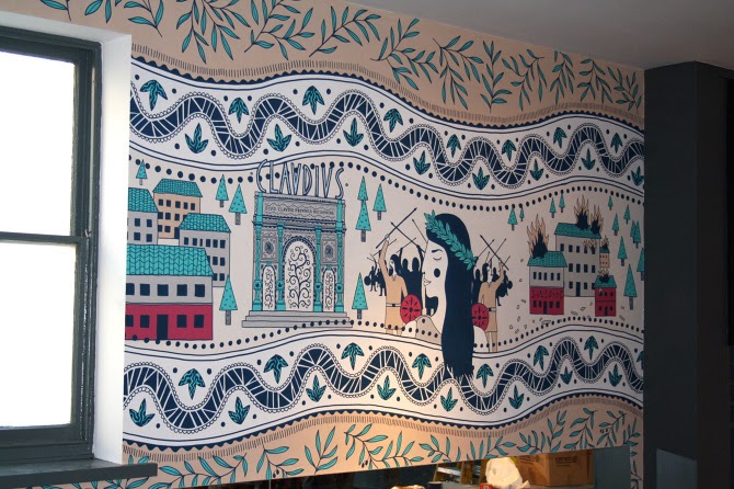
Zizzi Camulodunum!
Roman inspired mural
Zizzi Ristorante commission James Grover to create two murals for a refurbishment of their Colchester restaurant.
The first of the murals was inspired by Roman pottery and mosaics, James immersed himself in the history of Colchester (or Camulodunum as it was known in Roman times) to make this gorgeous decorative piece. The second appears on the stairway at the restaurant, a star in the night sky with “Twinkle, Twinkle, Little Star” written around the edge of a diamond - originally written as “The Star” by English poet and former Colchester resident, Jane Taylor. Both works of art were painted using acrylic paint pens and emulsion, and surely transform the interior from restaurant to gallery!
Labels:
decorative,
Food and Drink,
history,
James Grover,
lettering,
mosaic,
mural,
patterns,
pottery,
public art,
restaurant,
Romans,
stylised,
Zizzi Ristorante
Thursday, January 30, 2014
Owls are in the Air
![]() |
| logo for Little Owl Urns |
![]() |
| ad for Rockwood and Perry |
Kathryn Rathke completes two beautiful owl commissions using her confident and stylish line.
Custom-designed urns maker 'Little Owl Urns' asked Kathryn to create a logo for the bottom of their ceramic and wooden pots; made for beloved pets. The second was for the wine merchant Rookwood and Perry in the Hudson River Valley to use as an advertisement for their shop. With the image of the nocturnal bird being used quite widely right now, Kathryn says "Owls are in the air!"
Labels:
Animal and Nature,
birds,
black and white,
drawing,
Food and Drink,
Kathryn Rathke,
line,
logo,
loose,
owls,
pen,
pen and ink,
sophistication,
wine
Friday, January 24, 2014
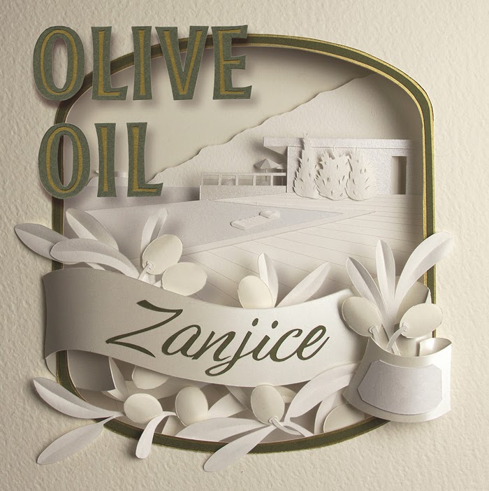
Zanjice Olive Oil
This
fabulous label creation from Gail Armstrong is a personal project done as a "thank you" for some friends.
After a holiday last summer in Zanjice - a fairly cut-off part of Montenegro, Gail discovered that all the olives from the
area were gathered from everyone's property at the end of the season and sent
to the community press to be made into olive oil. She says " However, the hand-written
labelling left much to be desired, so as a "thank you" I created
these olive oil labels. The paper sculpture scene is the view across the
swimming pool of one of the landmark villas in the area and the ribbon flourish
has a blank area where the date of pressing can be written."
Labels:
3d,
Food and Drink,
GAIL ARMSTRONG,
label,
olive oil,
packaging,
paper engineering,
paper sculpture
Tuesday, December 10, 2013
Food Poisoning
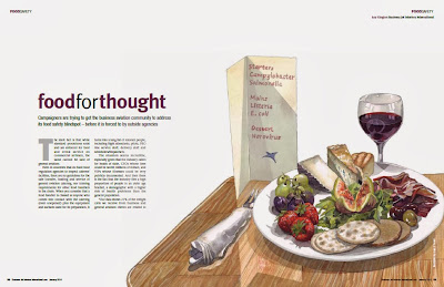
Liam O'Farrell illustrates an article on food poisoning for Business Jet Interiors International.
The key point of the piece was how easy it is to think that only low grade produce such as van burgers and greasy kebabs are the foods that carry harmful bacteria and viruses. Liam chose to illustrate a delicious plate of food placed next to a menu listing some dreadful food poisons, showing that good quality foods can also be harmful if prepared or stored badly. Liam says "It was an interesting project and for me this was a great opportunity to buy some pretty top nosh and get it all on expenses, which indeed I did...the initial brief called for oysters to be shown on the plate. I bought six and sketched up a few. The client soon abandoned them as they would not fit with the other foods chosen. 'Fantastic' I thought, so I promptly ate them. Three hours later I was brutally sick and spent the evening with my head in the loo. It reminded me of 'Roald Dahl's Tales of the Unexpected' and much amusement was had by all at my expense. I didn’t miss the deadline though."
The article can be seen here.
© 2013 UKIP Media & Events. All rights reserved.
Article published by kind permission of Business Jet Interiors International, January 2014
Labels:
editorial,
food,
Food and Drink,
Liam O'Farrell,
loose,
realistic,
restaurant,
watercolour,
watercolours
Thursday, December 5, 2013
Propercorn
Zoe More O'Ferrall works on the new packaging design for Propercorn.
As well as being London Fashion Week's official snack, the 'Popcorn start up' has done very well and had a mention on the Vogue blog last year. Zoe's hand drawn delights give the packs a feel of an unopened book, with a tasty treat inside!
Subscribe to:
Posts (Atom)