Showing posts with label lettering artist. Show all posts

Thursday, January 2, 2014

Bill Wyman Logo


http://www.illustrationweb.com/RuthRowland

Ruth Rowland works on the new Bill Wyman logo for his official web site.
Ruth says "The development stage included a range of hand rendered styles, from handwriting akin to his own signature to this wilder version of his name using a dry brush to create a distressed, edgy mark. Combined with the designer's bold background and retro photo, the lettering makes a powerful impact on the music legend's homepage."

Wednesday, December 18, 2013

Reading Unbound


http://www.illustrationweb.com/ShaunaLynnPanczyszyn

Scholastic commission Shauna Lynn Panczyszyn to create a book cover illustration for 'Reading Unbound'.
The brief was to make a chalk cover using a list of buzzwords, Shauna says "I played (with) the words and worked to make them feel fun and lively, as well as pulling in a few fun elements like the Mockingjay pin for the Hunger Games (one of my favorite books!)".
The book argues 'Why Kids Need to Read What They Want--And Why We Should Let Them" and is out in January.


Friday, December 6, 2013

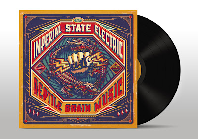
Reptile Brain Music


 http://www.illustrationweb.com/BoomArtwork

http://www.illustrationweb.com/BoomArtwork


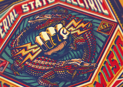
BoomArtwork produces an album cover for Swedish rock band Imperial State Electric.
Nicke Andersson; former front man of The Hellacopters approached BoomArtwork to create the art for the vinyl album of his new band. He asked for something bold and vintage to illustrate the record title 'Reptile Brain Music', so BoomArtwork set to work using his fabulous design and illustrative skills and made this punchy retro visual, he says "... First I drew the hand of Zeus with my brush and ink, and then the crocodiles eating each other's tail. In Photoshop I placed everything together and then started with the typography. Instead of using an existing typeface I thought it would make the album more special to create custom lettering. After finishing I added some filters to make it look like it was released in the 70's. It was so much fun to illustrate an LP album cover, as it is such a cool, tactile canvas to work on."

Wednesday, November 13, 2013

Doctor Who Time Capsule

http://www.amazon.co.uk/Doctor-Who-The-Time-Capsule/dp/B00DUBD4R2/ref=sr_1_1?ie=UTF8&qid=1384349540&sr=8-1&keywords=doctor+who+time+capsule
The box set

http://www.illustrationweb.com/RuthRowland
DVD cover

Ruth Rowland works on the lettering for the limited edition Fourth Doctor Time Capsule for the BBC.
This luxury product aimed at the dedicated fan, celebrates Tom Baker and the 50th Anniversary of the Dr Who TV series, with a limited run of 5,000. Ruth Says "The box itself is designed to look like a Gallifreyan artefact and with this in mind, I was asked to create both English and Gallifreyan lettering for the DVD covers. This involved some very enjoyable research, looking at stills from old Doctor Who episodes and discussing the appropriate feel and layout of the two different alphabets with the art director. Once printed the title had the added bonus of only being legible once seen through the coloured disc provided." (Watch the video). The box set is 'lovingly put together' and full of Tom Baker goodies.

Friday, October 25, 2013

Lang is one of the finest*


Helen Lang works on several product and packaging concepts for the Tesco finest* range.
Commissioned by P&W London, Helen created the hand lettering for three dipping oils and rapeseed oil. She says "The brief was to make it look hand rendered as though someone had created their own infusions and written on the labels as a home cook would do." More products with Helen's work will be released soon.

Wednesday, October 2, 2013

Shauna Lynn Panczyszyn's Scrapbook


Illustrator, lettering & digital chalk board artist Shauna Lynn Panczyszyn opens the door on her studio in Orlando, Florida. See Shauna's Scrapbook.

Monday, September 9, 2013

Type Tasting


Ruth Rowland will be taking part in the Type Tasting Exhibition, run as part of the London Design Festival at the Victoria & Albert Museum. The exhibition and drop in workshops are ‘open to everyone with a love of letterforms’.

Ruth says “I submitted a piece of work for the exhibition, we had to choose a word that described London. I was drawn to the word 'expressive' as it reflects what I love most about London - its dynamic, ever-changing cultural scene. In addition, it's a term often used to describe the loose, gestural nature of much of my work. I like to experiment with mark making, tools can vary from the beautifully hand crafted ruling pen used here, to a piece of old stick from my mother's garden. Pens and brushes are the tools of my trade, I've been collecting them for years, I like the fact that each one has its own distinctive characteristics.”

If you’d like to see Ruth in action, the workshops take place on 14th and 15th September. Go here for more information.

Tuesday, August 6, 2013

New Talent Alert...


Hand letterer Shauna Lynn Panczyszyn  joins the artists at Illustration, bringing a fabulous obsession with chalk!

Tuesday, July 16, 2013

Breathing Easy


Chrissy Lau was recently commissioned by Men's Health Magazine Australia to create a 'very elaborate and beautiful' typographic illustration for a feature on breathing better. Asked to create typography that was not only stylish, current and visually striking, the lettering also needed to link seamlessly with the delicate bronchi of the lungs. She has done a super job here.