Showing posts with label typography. Show all posts

Tuesday, July 16, 2013

Breathing Easy


Chrissy Lau was recently commissioned by Men's Health Magazine Australia to create a 'very elaborate and beautiful' typographic illustration for a feature on breathing better. Asked to create typography that was not only stylish, current and visually striking, the lettering also needed to link seamlessly with the delicate bronchi of the lungs. She has done a super job here.

Monday, January 14, 2013

SPLC


Ruth Rowland creates a typographic card for the Southern Poverty Law Center.

SPLC is a nonprofit civil rights organization dedicated to fighting hate and bigotry, and to seeking justice for the most vulnerable members of society. Ruth was asked to illustrate a card to be sent out to donors as a sign of SPLC's appreciation using a quote that fits with their message of justice and tolerance. Ruth has produced a purely typographic solution with this Anatole France quote, 'aiming to give the words the right tone and emphasis'. She says "I've worked for the design team at SPLC on several occasions so it was a pleasure to be asked to work on this holiday card. They have, by all accounts, a very impressive donor list which (despite my efforts!) they're not allowed to disclose!"

Wednesday, November 21, 2012

Vic Lee's Scrapbook


The streets & stories of London are brought to life in Vic Lee's art & typography. Vic Lee's Scrapbook.

Wednesday, November 14, 2012

Which? Lettering


Ruth Rowland was delighted to be asked to create the cover lettering for the latest issue of Which? Magazine. It features an article about energy tariffs and how few people understand them. Ruth says "This illustrative piece uses different styles, weights and sizes of lettering to indicate the different answers given and the general confusion on the subject."

Wednesday, November 7, 2012

Crafty Types


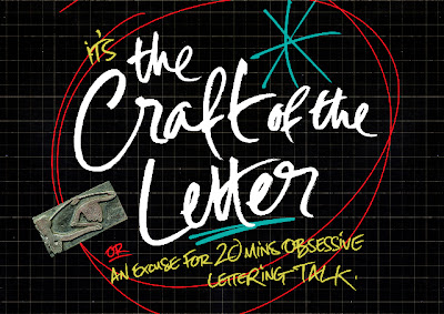
Lettering artist Ruth Rowland will be giving a talk about her work on the evening of 13th November at St. Bride Library. Tickets are available from the library website and will 'help to fund this important resource for future generations'

"Join us at St Bride Library for an evening celebrating the craft of the letter. From considerations of language and the design process, to spontaneous mark-making and precision, leading practitioners Catherine Dixon, Si Scott, Ruth Rowland and Sam Winston will explore the subject through their own working practices."

Worth a visit if you're in the area:  St Bride Library, Bride Lane, Fleet Street, London EC4Y 8EE.

Thursday, March 1, 2012

Rowland's Diagrams


Ruth Rowland's versatility as letter artist and illustrator continues with these diagrams using her individual skills. Ruth says "Encouraged by the popularity of my maps, I've started to produce a range of diagrams....... Loose and dynamic - these new additions to my portfolio are based around the subject of astronomy and aim to convey accurate information while capturing the excitement of the subject."

Friday, February 24, 2012

Sam's Words


These two pieces are from Sam Bevington's ongoing personal project experimenting with hand drawn type.The text is cleverly designed by Sam, with no fonts involved. Sam says "The words themselves are from a couple of northern soul classics: 'Come on Train' by Don Thomas and 'Messin with the Kid' by Junior Wells.

Wednesday, February 8, 2012

Ruth Rowland's Scrapbook


Lettering artist and illustrator Ruth Rowland on her collection of hand written Victorian letters, printed ephemera & physical letters adorning her East London loft space. Ruth Rowland's Scrapbook.

Sunday, December 11, 2011

Romantically Yours


Having worked on the latest release from Cliff Richard this summer, Ruth Rowland was pleased to be asked to work for another British icon - Twiggy. Released by EMI, Twiggy's brand new album Romantically Yours marks a return to her music career with a collection of her hand-picked favourites. Ruth was asked to work on the artist's name for the CD cover and started by taking her signature as the original reference. Using a dip ink pen that was sympathetic to the line quality and flow of the signature, Ruth says "I fine tuned the letter forms and opened up the letter spacing to maximise legibility while trying to keep the spontaneity and character of the original."