Showing posts with label calligraphy. Show all posts

Tuesday, August 6, 2013

New Talent Alert...


Hand letterer Shauna Lynn Panczyszyn  joins the artists at Illustration, bringing a fabulous obsession with chalk!

Wednesday, May 1, 2013

Ruth Rowland at the Scrapbook Live Event


Next Thursday 9th May sees Ruth Rowland showing work at the Scrapbook Live Event, Griffin Gallery, London, organised by ourselves! Ruth says " I have my pens, brushes and inks primed for some pretty wild and loose demonstrating. Alongside the calligraphic work, I'll be showing some 3D letters created especially for the event, combining type with my own hand lettering in a variety of media. It promises to be an exciting evening with illustrators Miss Led, Jacqueline Bissett, Sarah Beetson and Gail Armstrong all demonstrating alongside me. In total, twenty one artists will be showing work and the evening will be hosted by journalist and writer Garrick Webster with sounds by DJ Dirty Freud." You can follow the event live on twitter at #ScrapbookLive.

Monday, February 25, 2013

Mathematics Reform


Harvard Graduate School of Education asked Ruth Rowland to contribute to their Winter issue of Ed. Magazine. The result is this series of illustrations for the cover, a double page spread and a half page illustration for an article about mathematics reform in the USA.
Ruth says "I enjoyed combining chalkboard with squared paper backgrounds, numerals and equations to illustrate the piece. The design team's simple but witty idea for the cover, a pseudo-math equation, was carefully rendered to read both as an equation and the subject of the article. Inside the magazine, I retained the simple colour palette to keep the more complex illustrations eye-catching and legible.

Wednesday, November 14, 2012

Which? Lettering


Ruth Rowland was delighted to be asked to create the cover lettering for the latest issue of Which? Magazine. It features an article about energy tariffs and how few people understand them. Ruth says "This illustrative piece uses different styles, weights and sizes of lettering to indicate the different answers given and the general confusion on the subject."

Wednesday, November 7, 2012

Crafty Types


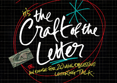
Lettering artist Ruth Rowland will be giving a talk about her work on the evening of 13th November at St. Bride Library. Tickets are available from the library website and will 'help to fund this important resource for future generations'

"Join us at St Bride Library for an evening celebrating the craft of the letter. From considerations of language and the design process, to spontaneous mark-making and precision, leading practitioners Catherine Dixon, Si Scott, Ruth Rowland and Sam Winston will explore the subject through their own working practices."

Worth a visit if you're in the area:  St Bride Library, Bride Lane, Fleet Street, London EC4Y 8EE.

Monday, October 15, 2012

Websters Pen Shop


Ruth Rowland uses her lettering talents on a commission for Websters Pen Shop. She explains "As a great lover of writing tools of all shapes and sizes, it seemed appropriate for me to be asked to work on a strapline for Websters Pen Shop. The British company is celebrating 40 years in the business and commissioned a new logo for the event. Hand lettering was chosen over a font to express the uniqueness of the written form - something Websters promote with their impressive range of pens. The lettering was used in a one and three line format along with the designer's logo across both printed and online advertising. The loose but legible style reflecting the soft flow of a fountain pen."

Wednesday, August 29, 2012

The Testament of Jessie Lamb


Ruth Rowland has recently produced this hand lettered title for Edinburgh publishing house; Canongate Books. Ruth's creation 'works with the evocative image to give the cover an intimate, confessional feel.'

Monday, June 11, 2012

Longleat House


Ruth Rowland was recently asked to work on some lettering to promote Longleat House, an impressive example of Elizabethan architecture, set in beautiful Wiltshire countryside in the UK. Home to the 7th Marquess of Bath, the house is surrounded by 900 acres of ‘Capability Brown’ landscaped gardens and parkland. The lettering was designed to work with the hospitality side of the business, so as well as the site, it will be seen on wedding and corporate events brochures, stationery and promotional material. It needed to reflect the elegant, historic surroundings with a contemporary flourish, so Ruth focused on a soft italic hand, aiming to keep a fine balance between the flow of the line and the legibility of the form.